Workflow editor
The workflow-based profiles make it possible to build the operational processes and the appearance of the ticket dispenser interface in a visual editor, without programming knowledge. In the workflow editor, instead of a structure, pages and dialogs can be created. Pages can be service selection pages, information pages, form pages, confirmation pages, etc. Buttons, text elements, images, input fields, virtual keyboards, QR codes, web regions, etc. can be placed on the pages. Navigation between pages can be defined in the workflow editor, so it can be specified which page the system should redirect to when a particular button is pressed. The workflow editor also makes it possible to use variables — for example, values entered in the input fields of a form page can be stored in variables, and these values can later be used on other pages of the workflow, or even during ticket printing.
Using workflow-based profiles, the ticket dispenser interface can be fully customized, and it is possible to create complex operational processes without the need for custom development.
To use the feature, you need to purchase the SH87 Workflow editor module.
Overview
Interface
Select the resolution fits for the screen of the ticket dispenser Select the rotation of the screen, horizontally or vertically Fit the screen Zoom in Zoom out Show or hide the selected elements' highlight Bypassing the click events. When active, the display will act like the profile shown on the ticket dispenser. Use this to navigate through the different menus and selectionsFunctionalities
The right hand side shows the root elements, which has the Template, that contains the main logic of the workflow, which can be customized further by adding buttons with different functionalities. In the Template root element, the home page can be set, and the reaction for the main functions, such as ticket printing, CRM identification, booking success and failure.
Any number of pages and dialogs can be created.
Elements
Common properties
- Name: Name of the element
- Visibility:
- Show: the element is always visible
- Hide: the element is always hidden
- Hide when authenticated: the element will be hidden if the user authenticates themselves on the ticket dispenser
- Show when authenticated: the element will be shown if the user authenticates themselves on the ticket dispenser
- Positioning: the top, left, bottom, right values determine the size of the element, based on the relative distance to the edges of the entire screen
- Shadow, shadow color, size, inset: determines if a shadow would be applied to the element, the color and size of the shadow, and if the inset shadow would be drawn inside the element's border
- Padding: the top, left, bottom, right values determine the padding area of an element
- Border type and border radius: the type of the border to be displayed, and its radius
- Background color: the color applied to the element's background
- Background image: the image applied as the element's background
- Icon:
- URL: points to the location of the image, whether it is on the internet, or stored in the media storage
- Position: positioning of the icon inside the element
- Padding: determines of the padding area of the element used to position the icon
- Height: size of the icon inside the element
- Text: the name and the description of the element for each active language, which will be displayed inside the element
- Font:
- Family: the type of the font
- Size (%): the relative size of the text
- Line height (%): Determines the amount of vertical space between lines of text in the element
- Text color, Font style, Alignment: the color of the text, the bold\italic\underscore style, and the alignment of the text inside the element
- Shadow: applying shadow to the text, selecting the shadow's color and its size of the shadow
Special properties
Button

The Button is clickable object which reacts with the configured action. The following reactions can be configured to the Clerk list as well:
- Close: if placed on the dialog, it will close it
- Close reason: in case custom JavaScript codes would be used, an arbitrary value could be provided passed by this field, which would be used by the JavaScript to apply a custom set of logic
- Cleanup: clears all stored data from the user session (including ID, selected service, etc.)
- Jump to page: displays the configured page to the user
- Back to previous: displays the previous page to the user
- Show dialog: displays the configured dialog to the user
- CRM Identify: challenges the CRM system for identification
- Variable name: the name of the variable of the ID which will be challenged
- Validate booking code: challenges the booking system for validation
- Variable name: the name of the variable used for the booking code which will be challenged
- Print ticket: issues a ticket
- Input character: types the configured characters to an input field
- Variable name: the characters will be typed to those fields, which have the same variable name
- Input characters: the selected set of characters
- Custom JavaScript: runs a custom JavaScript
- QR code reading: displays the preview of the camera for the reading
Service button
The Service button acts the same way as the Button with the same configurable functions, except it will pass the configured service along with configured action.
Input field
The Input field is used to pass over a custom set of user provided data (such as ID, booking code, etc.)
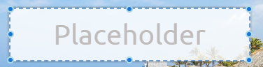
- Placeholder: a background text display in the element for each language
- Variable name: The characters typed here will be stored as a variable named as defined here
- Save masked input: The ID will be passed to the CRM system with the mask characters included. E.g. if the mask is +7-000-0000 the value will be passed as +7-123-4567, if turned off, the value will be 1234567.
- Min\Max: the allowed minimum and the maximum amount of the characters
- Mask: the technical details are described here
- Code hide type: the technical details are described here
Language button
The language button is specifically used to change between the active languages.
Text
Add a customizable text to the design.
Clerk list
Add the list of the available clerk for the configured services in case the clerk selection is allowed.
Service list

The list of the available services.
Lottie
Inserting rendered vector animations from JSON files.
- URL: Copy here the URL pointing to the JSON file or copy here the entire content of the JSON file
- Loop: Play the animation in loop
- Speed: The playback speed of the animation
- Delay: Delaying the animation start
Web
Adding a webpage to the design.
- URL: The URL of the webpage to be displayed
- Scale: The internal sizing of the content (magnification)
- Refresh time: The webpage will be refreshed upon the configured time
- HTML: Custom HTML code
Image
Adding an image to the design.
Smart Ticket QR
Displaying the QR code for the Smart Ticket feature. If the QR code is interacted with (clicked on), a 'Jump to page' or a 'Show dialog' reaction can be configured, for example to display further information.
QR Preview
If the QR-code reading is turned on, this region will display the preview of the camera for the reading. If the QR code has been read a 'Jump to page' or a 'Show dialog' reaction can be configured.
Keyboard
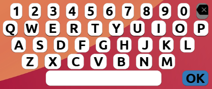
Adding a customizable keyboard. The keyboard layout is customizable. The OK button can be configured to function as a button with a preconfigured action.
Countdown
Adding a countdown animation to be used in cases where the time-out feature is configured.
- Countdown: the time until the circle completes a cycle
- Size: the size of the countdown ring
- Stroke width: the width of the countdown ring
Capabilities
The following video shows an example of customizing a service, which instead of printing a ticket, prompts for identification, and in case it is successful, redirect the customer to a page, where a new service is available.
In this showcase, the following were done:
- Creating a new page (Identify), on which the identification will be done
- Adding text, customized keyboard and an input field with the ID variable, and an OK button with 'CRM Identify' function to challenge the input field's variable to the CRM database
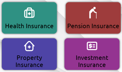
- Editing the Pension Insurance service button to function as 'Jump to page' to the newly created Identify page
- Creating a new page (VIP Pension) for the custom 'Pension discount' service and customizing it
- Editing the template by selecting the action upon 'On CRM identified' to 'Jump to page' with the reaction of 'VIP Pension'