Ticket dispenser profiles
For the ticket dispenser units the profiles need to be configured on the following pages. You can modify an existing profile or can create your own.
Common tab
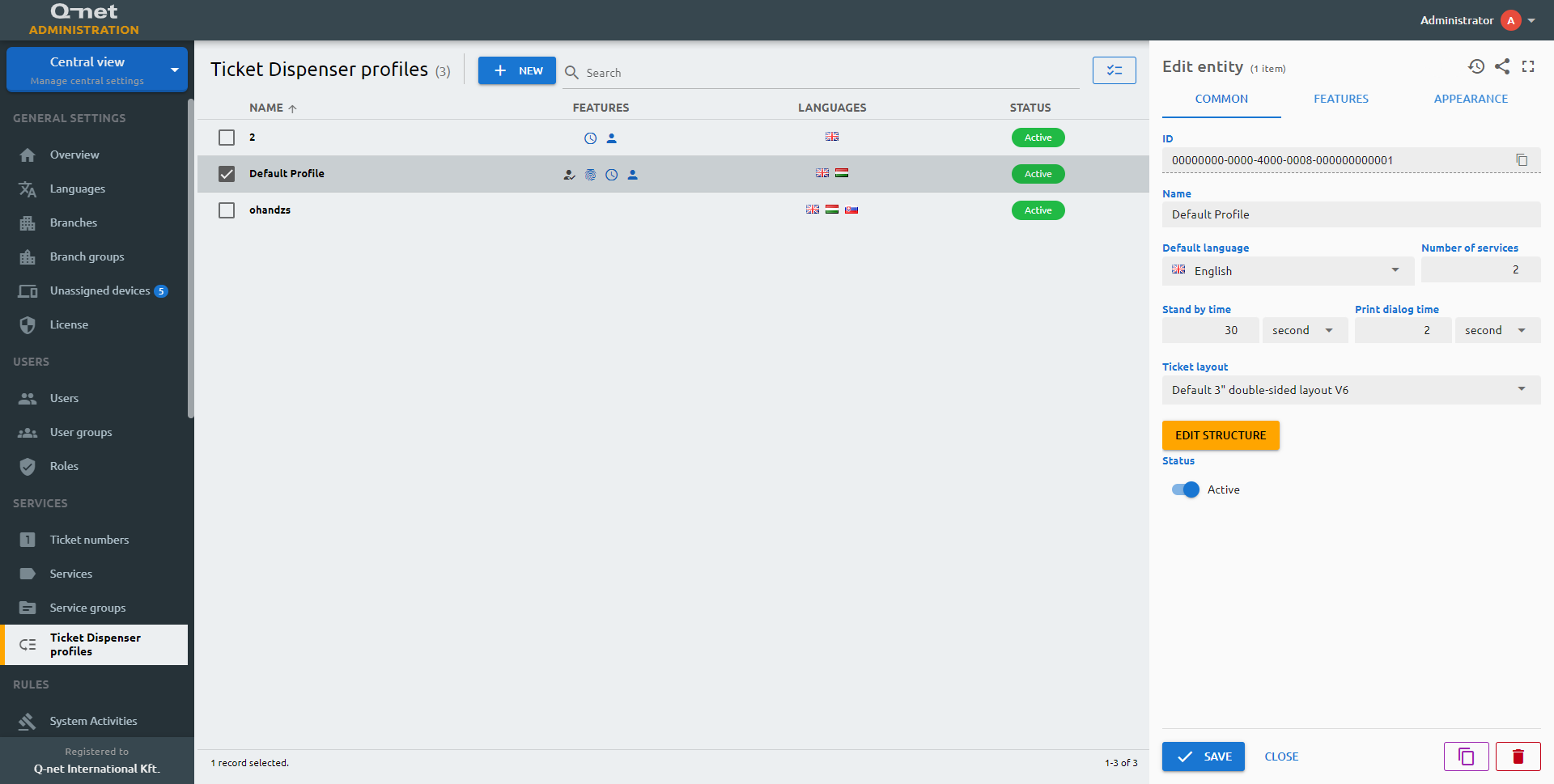
Name
Name of the profile.
Default language
You can select the Default Language of it with selecting the desired one from the dropdown menu.
Number of services
You can set the number of services available to be selected to a ticket.
Stand by time
Is the value of the time in seconds that specifies the limit of the screens appearing on the dispenser profile when to return to the set main page. I.e.: a customer has selected a non-relevant service group that doesn’t contain the service that s/he has been looking for and s/he doesn’t press back button – the screen will return to the main menu within the given time.
Print dialog time
Duration of the print dialog appearance.
Inactivity dialog time
If the Standby time has elapsed, a countdown window will appear with the given time before dropping back to the main menu.
Ticket layout
Every Q-net provided ticket dispenser has a built in printer. The size of these printers can be 2 or 3 inches. 3” printers has a double-sided version also. You will be able to select the right layout for your ticket dispenser based on the size of printer here.
ID
The ID is given by the system and is required for internal processes, and can serve purposes for debugging in case of issues.
Status
Active/Inactive switch to determine if the dispenser profile should be used by the system.
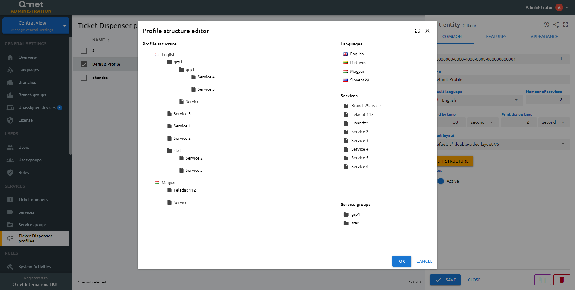
Edit structure
Clicking on this button will open the drag and drop ticket profile editor in a new dialog.
You can edit the profile structure in a drag and drop area with two main sections. The profile structure and the available items let you set the exact needs of the client for the structure of the selectable services topology. The available items include the added and enabled languages, the active service groups, and the services. You have to drag and drop the desired items one by one to configure the topology. When a service group is added to the layout, the services of the group are automatically added as well.
Closing the dialog will not save your layout. Make sure to save everything by the Save button at the bottom.
How to create a new profile
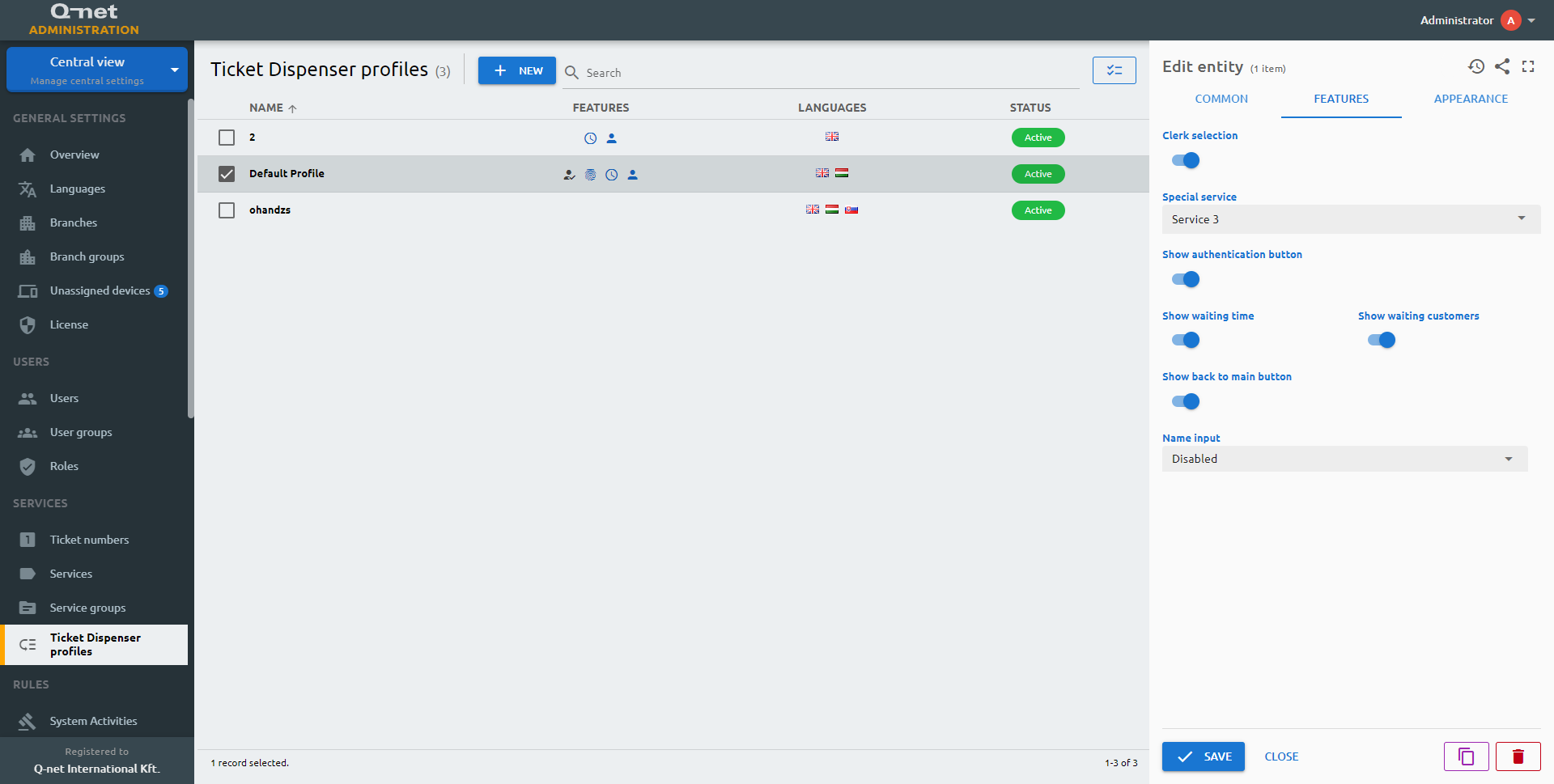
Features tab
Clerk selection
Enables the clerk selection on the ticket dispenser interface via the uploaded clerk photos.
Special service
Some ticket dispensers has an additional physical button on the ticket dispenser for blind and partially sighted customers, for this button we can select a special service by selecting a service from the Special service dropdown menu.
Show authentication button
Enables the authentication button on the ticket dispenser
Show waiting time
To inform customers about the estimated waiting time enable Show estimated waiting time.
Show waiting customers
To inform customers about the service queues, queue size can be displayed besides the service names on the profile.
Show back to main button
Enables the back to the main menu button on the dispenser
Name input
Name input can be optional or required. In some use cases, it can be useful to call the clients by their names. The client can enter his name on the dispenser and the system will store this data for further use by enabling this feature.
Show appointment button
Show the appointment button on the main screen to enable customer’s to validate their reserved appointment.
Customer name
If the optional or required is selected, the customer can or must enter a name, which will be used to call the client on the main waiting area display.
Enable advertisements
Enable or disable the advertisements for this profile.
Idle time
The advertisements will be displayed after the set idle time.
Groups
Select the advertisement groups which will appear on the ticket dispensers.
SMS ticket
The SMS ticket feature is an alternative paperless solution besides the ‘give-a-nick’ option. In this case, before the ticket printing, the Ticket Dispenser asks the customer to enter his/her phone number and sends the ticket number via SMS instead of printing a paper ticket.
Enable QR reading
Enables the QR code reading by the device used for appointments (suitable for Android based devices).
Enable QR reading
Enables the QR code reading by the device used for authentication (suitable for Android based devices).
Ticket advertisement groups
Select the advertisement groups which will appear on the printed tickets issued by the ticket dispenser.
SMS ticket
Enable the SMS ticket feature. Before the ticket printing, the ticket dispenser asks the customer to enter their phone number and sends the ticket number via SMS instead of printing a paper ticket.
Custom data
In case of an authenticated customer, the SMS will be sent to the phone number stored in the selected custom data field.
Mask
The mask to be used for displaying the phone number.
ID min length
Mininum length of the ID
ID max length
Maximum length of the ID
Save masked input
The ID will be passed to the CRM system with the mask characters included. E.g. if the mask is +7-000-0000 the value will be passed as +7-123-4567, if turned off, the value will be 1234567.
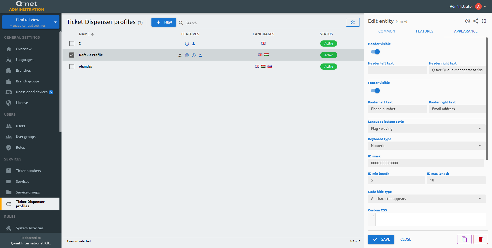
Appearance
Header visible
Hide or make the header of the dispenser visible
Header left text
Changes the left text in the header
Header right text
Changes the right text in the header
Footer visible
Hide or make the footer of the dispenser visible
Footer left text
Changes the left text in the footer
Footer right text
Changes the right text in the footer
Language button style
You can select the desired icon set for the country flags from the dropdown menu. There are two options available; one with waving flag and the standard one.
Keyboard type
Depending on the usage type, the keyboard type can be numeric or alphanumeric. You can select the keyboard type according to your need.
ID mask
A mask is a template that specifies the structure of identification codes such as ID number. If the ID min/max lengths are not set, filling every character of the mask is enforced. The definitions are the following:
- 0 - any digit
- a - any letter
- * - any character
- if a definition character should be treated as fixed it should be escaped by \ (e.g. \0)
Save masked input
The ID will be passed to the CRM system with the mask characters included. E.g. if the mask is +7-000-0000 the value will be passed as +7-123-4567, if turned off, the value will be 1234567.
ID min length
Minimum length of the ID
ID max length
Maximum length of the ID
Code hide type
You can choose from multiple options to hide the ID of a customer.
- All character appears
- All character hidden
- Last character appears
- Last character appears for 2 secs
Custom CSS
The Custom CSS editor allows you to customize the appearance of your dispenser without overwriting any other customizations.
Custom JS
If you want to enhance dispenser front-end functionality, you can add JavaScript to it.
Custom CSS example code
/* Common button style (e.g. in dialogs) */
.button {
  background-image: radial-gradient(at center top, #2b3127, #141612);
}

/* Service button style */
.task-button {
  background-image: radial-gradient(at center top, rgb(118, 166, 78), rgb(74, 106, 47));
}

/* Service group and back button style */
.group-button, .back-button {
  background-image: radial-gradient(at center top, rgb(74, 104, 49), rgb(25, 35, 16));
}

/* Page header & footer style */
.page .header, .page .footer {
    background-image: radial-gradient(at center top, rgb(72 85 62), rgb(25, 35, 16));
}

/* Page background color style */
.page {
  background-image: radial-gradient(ellipse at top, #6e736b, #2e3f24);
}

/* Page background image style */
.page {
  background-image: none;
  background: linear-gradient(0deg, rgba(0, 20, 0, 0.6), rgba(0, 20, 0, 0.6)), url('http://192.168.51.55:8080/media/storage/ayangku_4.jpg');
  background-size: cover;
  background-repeat: no-repeat;
}

/* Unique button color for a specific service */
.task-button[data-service-key="00000000-0000-4000-0007-000000000003"] {
  background-image: radial-gradient(at center top, #7e4ea6, hsl(273deg 38.43% 27.41%));
}